Working with InterResolve.
Hired as a UI/UX designer to manage the overall user interface and user experience of existing digital products. Their goal was to improve inefficiencies in the way collision management and insurance claims are handled after a road collision.
TOOLS


DESIGN TEAM
![]()
1
UI / UX Designer
A SPECIAL thanks to Geoff Leeks (Chief Operating Officer) and Aiden Dunne (Head of Research & Development), who without them I would have been lost :-)

Old app designs
01
Working on axiapp – crash advisor.
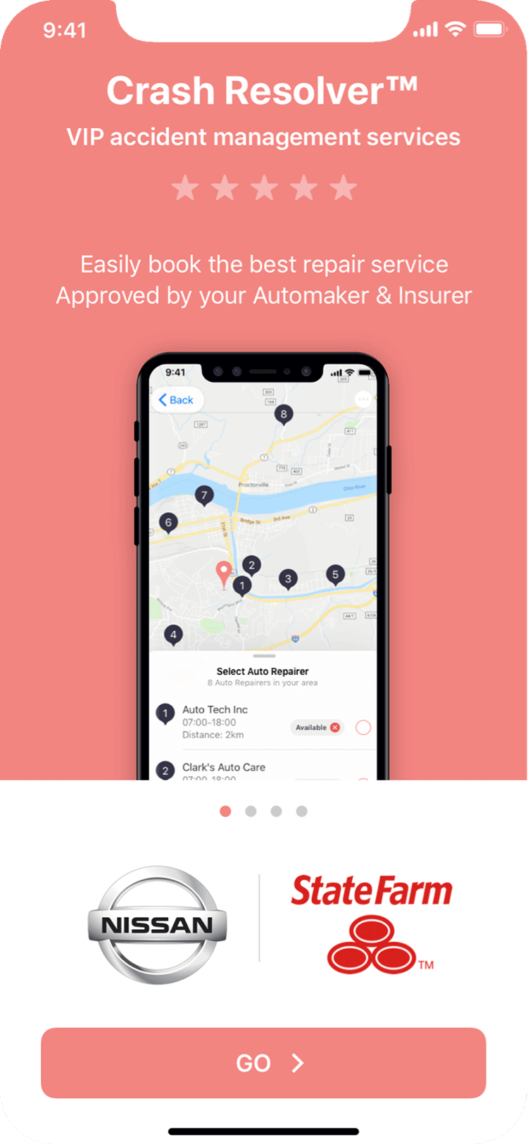
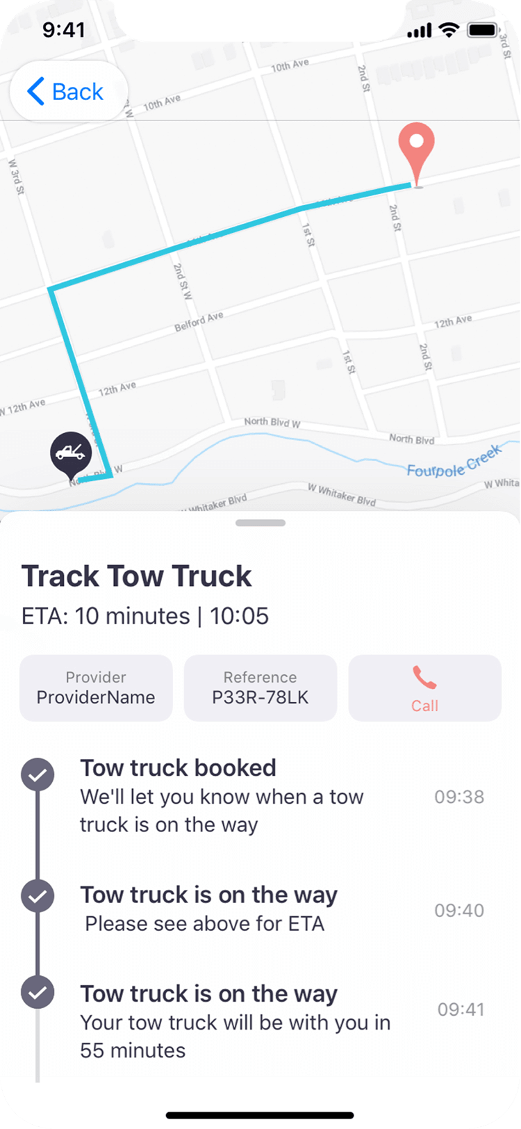
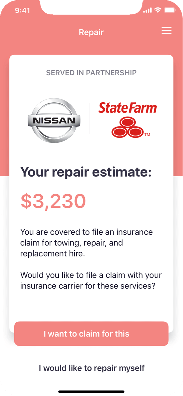
The task was to create an improved app that accounts, records and resolves accidents and damage done to your vehicle. The app was to act as a stress-relieving roadside assistant, efficiently guiding customers through the collision process, customer claims and interact with insurance carriers on the customer’s behalf. The existing app was seen by the business as slightly flat and in need of a visual lift.

App Design

Flow optimising

Prototyping

Video Walk-throughs
02
REVIEWING
Looking at the existing app, reviewing the accessibility, flow and identifying design / user experience problems, and small ways in which to optimise the experience.

03
VISUAL Identity
Whilst building on top of the existing brand, most of the explorations on expanding the visual identity were done predominately on the app.
The app at the time was the main focus for the business. Should the a visual theme work on the app it would then rollout to the other products.
04
TESTING
Once the desired theme was reached I then designed the journeys in the visual style. We then went on to testing customer journeys via prototypes.
Prototype created in Adobe XD

05
RETHINK
What was at the time meant to be a reskin and slight functionality re-jig, changed, as it was decided the app would greatly benefit from having a more personalised experience. A chat-bot feature was proposed which the business believed would make the post-accident experience an easier task to manage; This included quick focused questions in conversational tone to get through the process quickly. Working with the head of Product, a new optimised flow was created and new designs were explored.
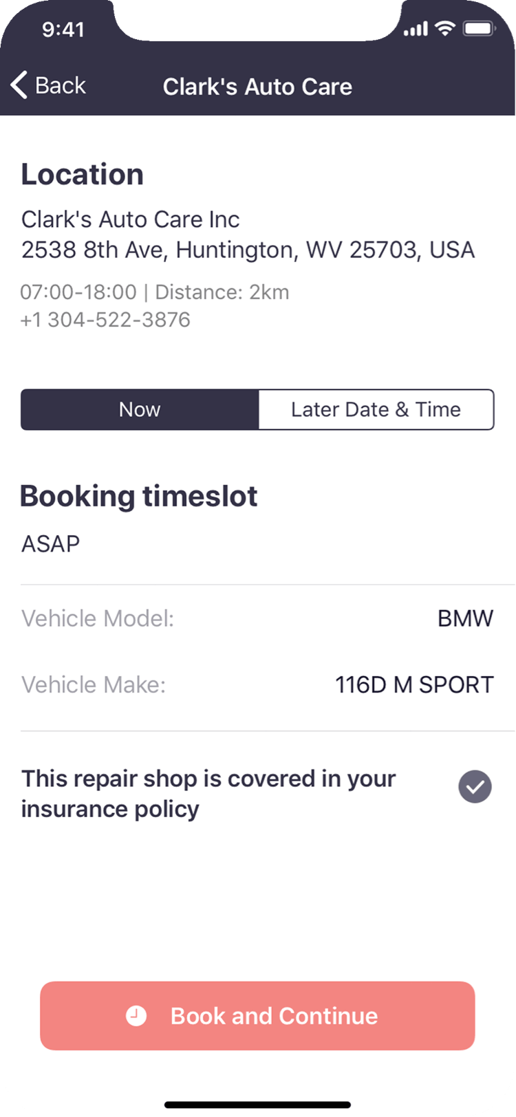
It was also proposed that we drop the cohesive branding and allow the UI components to be native to their respective operating systems. The task was then to adopt iOS and Android UI patterns to navigation, fonts, interactions, menus and sections.
This method would ideally make the experience clearer for the user who would already be familiar with their chosen OS conventions rather than having to learn our new patterns in a potentially stressful situation.




06
SHOW-PIECES
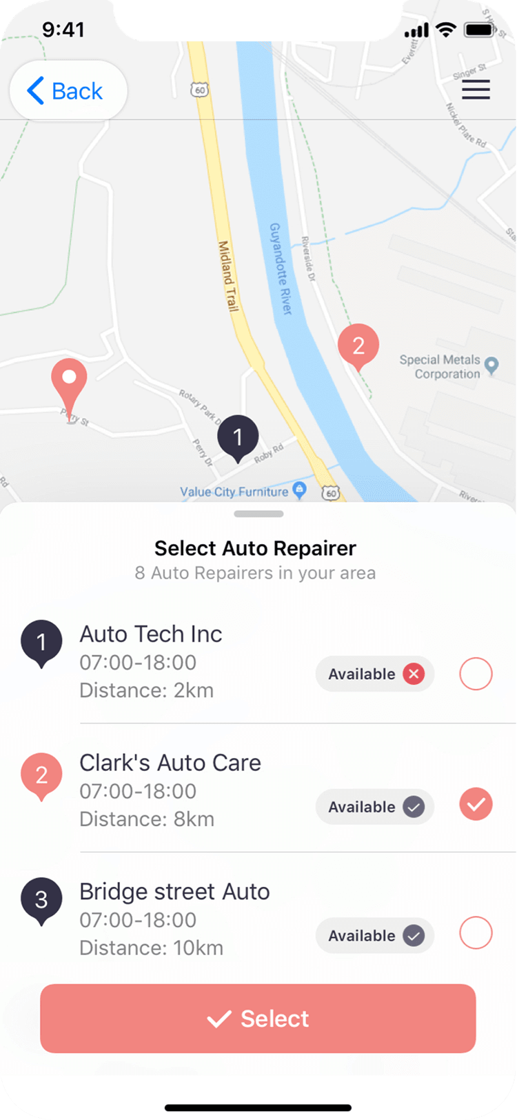
Using iOS as the example, a series of prototypes and video walkthroughs (created in Principle) of the app in action were produced. We would then review the behaviour and discuss how to make the experience more engaging and intuitive which would satisfy business and user needs.
Primarily ensuring the quality of each customer journey is thoroughly researched and tested.
These walkthroughs would then go on to act as demo pieces to guide and excite potential clients.
Axitech.
A start-up that provides collision management solutions for connected car organisations, enabling businesses to take control of their customer's insurance claims.

Project axiapp


