Designing for Eurosport.
Hired as a UI designer working on digital products spanning tvOS, responsive web and native apps. These websites and apps allowed users to access live and on demand content and view the latest news, features, scores and results.
TOOLS


DESIGN TEAM
![]()
1-2
UI Designers
![]()
1
UX Lead
![]()
1-2
UX Designers
A SPECIAL thanks to Alex La Mancusa (UX Lead) & Antony Wheman (design brother) and Palma Borsi (UX designer) with whom I worked closely.
French Open 2018 page
01
Shaping Eurosport 2.0.
The work on 2018's French Open with agency Code & Theory highlighted the opportunity for what the future of Eurosport’s digital platforms could be like. Inspired by their card design system and the initial style we had adopted, it was intended that we move things further to get closer to the future experience.

Responsive web

Prototyping

Design system / component libraries

Concepting

02
GOAL
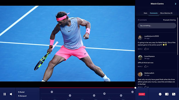
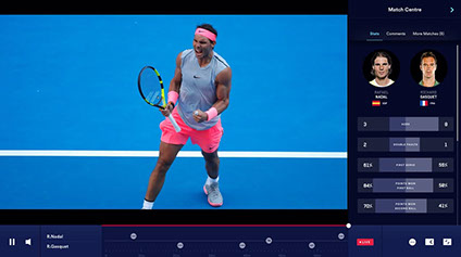
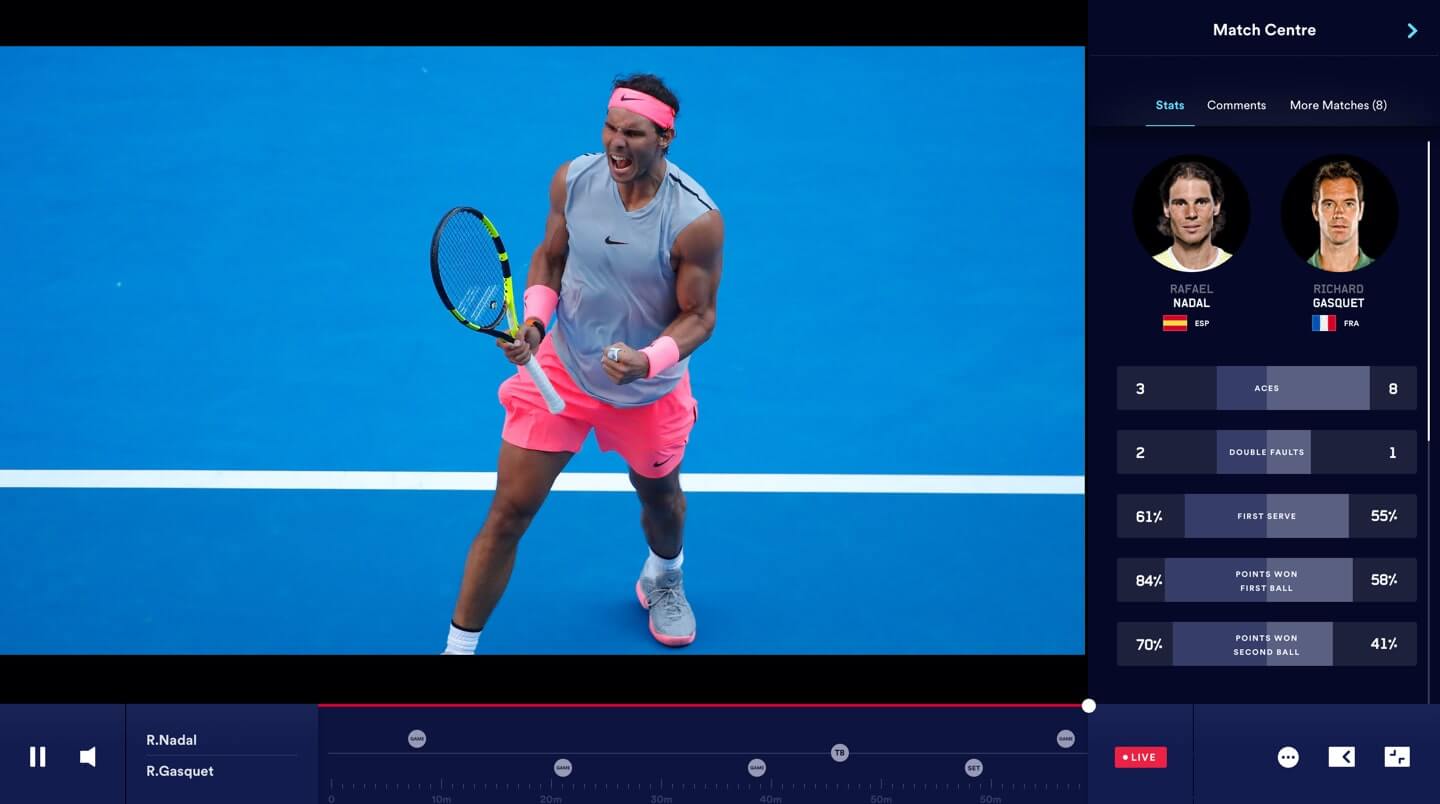
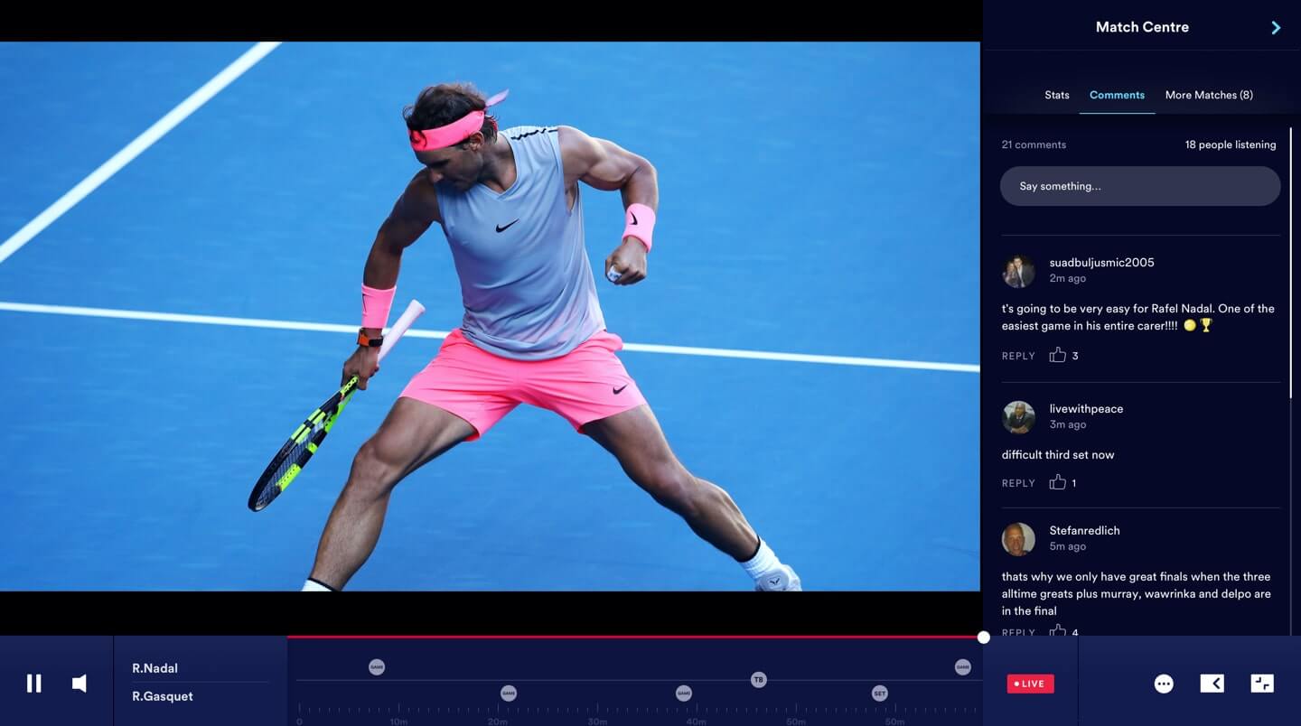
The vision was to have a one platform where watching live content and consuming sports news, results and commentary can be done simultaneously (currently done on two platforms). A flexible personalised service that adapts to different users, providing the fan all they need, during and after the event.
Due the nature of sport and the changing nature of the product in different markets, it was critical the experience was built flexible, adaptable and reusable. A new design language was proposed that would modernise yet simplify the products and services.

03
BRAND
Whilst design explorations were taking shape, it was necessary to record decisions into a progressive design system. This was an opportunity to review, finalise and record our colour palette, typography and layout for development teams and set in stone for any future designers.
04
Sport Design system
Adopting atomic design principles, a collection of reusable components was created. Guided by clear standards, these components can be assembled together to build virtually any number of pages.

05
Card framework
By introducing a card-based framework – we were given significant flexibility. This would improve customer experience and provide better support for business needs and revenue generation.

Different mock-up explorations continued as we tried to establish a lighter look and feel when showing heavy content-rich data, whilst also trying to convey a premium experience using a darker theme.

06
Component Library
The sketch component library was designed and built with flexibility in mind, to come together in multiple combinations and to support a range of user modes e.g. device, content type, light or dark mode, defined image-ratio and minimum & maximum CMS word counts.
07
CHALLENGES
The design challenges was designing cards that best served the stories the editorial team required.
The complexity of sport event data and how it varies sport to sport, proved difficult when knowing how to categorise these cards in terms of size and responsive behaviour.
Another challenge was differentiating through visual cues what was premium or free live or on-demand content.
Recorded Invison prototype
08
CONCEPTS FOR THE FUTURE
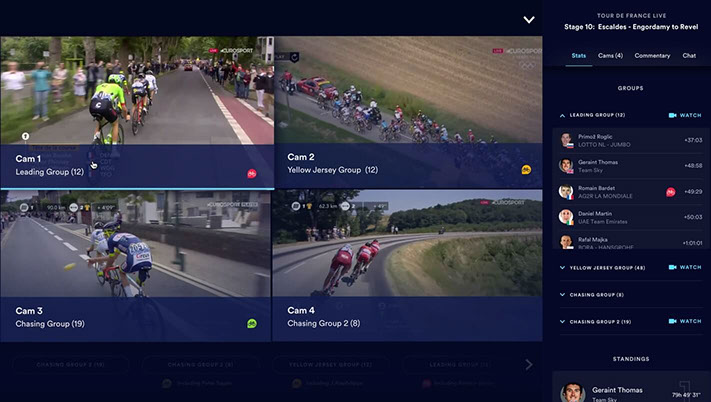
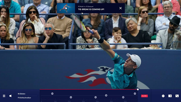
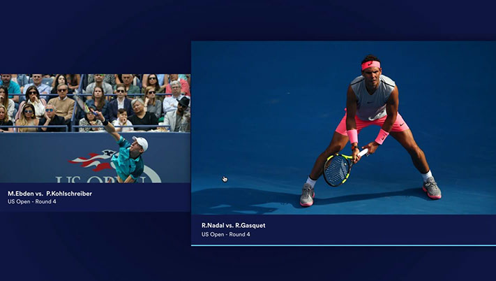
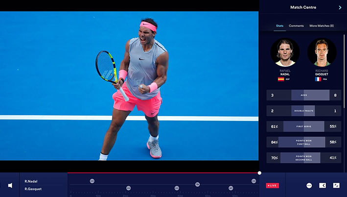
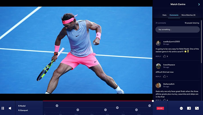
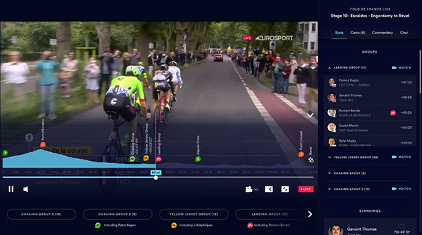
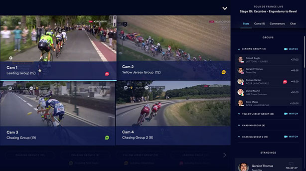
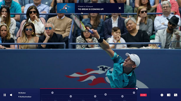
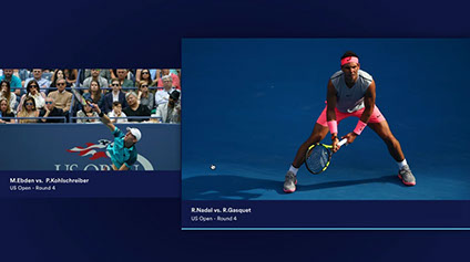
A series of conceptual designs were created to visualise the future of 2.0, based on what we believe will drive a sports fan to love the platform.
To feature examples of personalisation - highlighting training and shopping, supporting the different activities a fan wants to do to engage with their sport that go beyond watching.
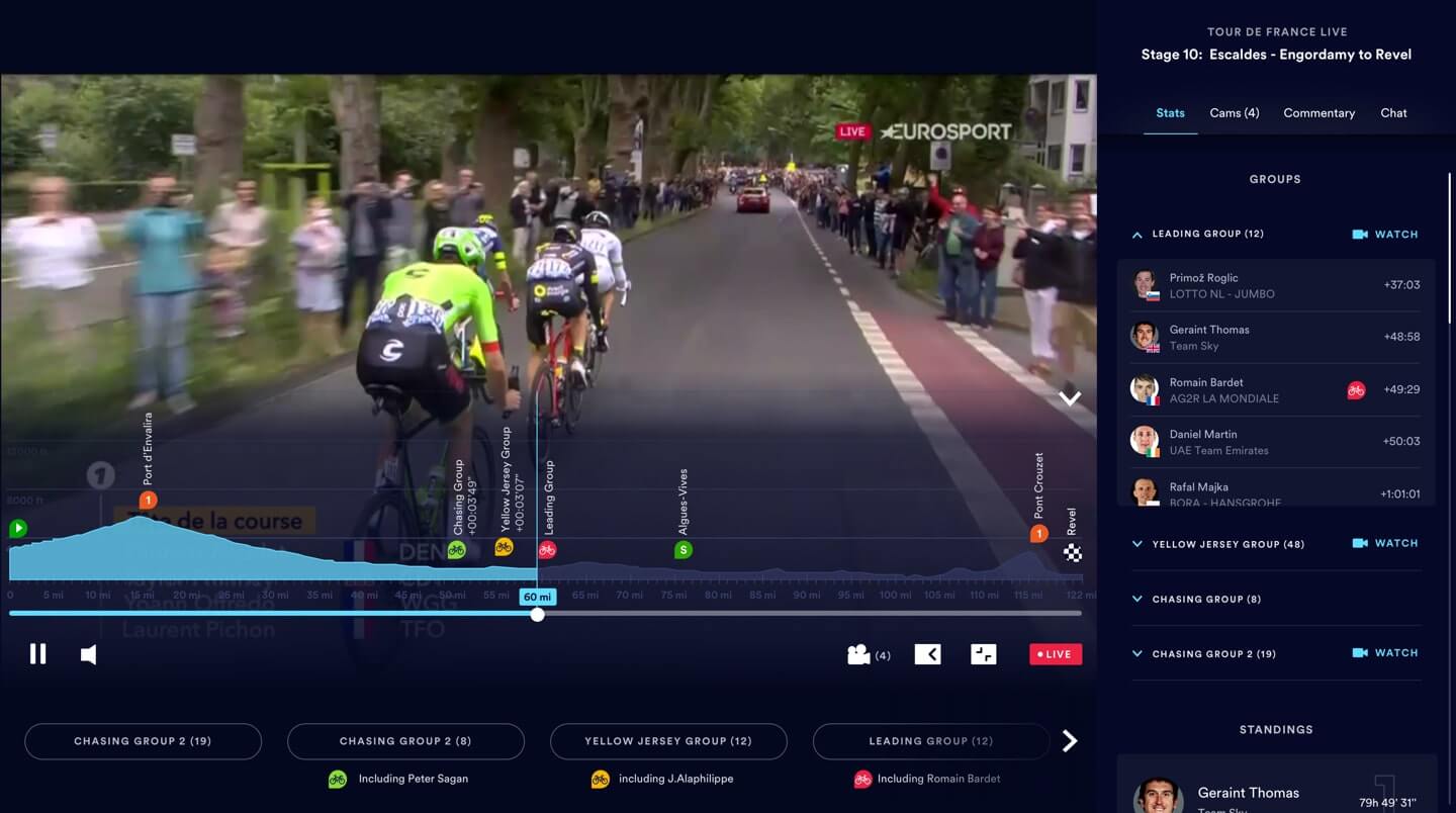
Providing unique viewing experiences and customisation for users who just want to watch sport or consume the richness of stats and data analysis.



Eurosport digital.
European television leader in sports providing live events, news, results, commentary and opinions.

Project 2.0


