Working with Vodafone Group.
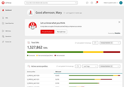
Hired as a UI designer to work on a IoT (internet of things) product. The IoT platform provides businesses a complete end-to-end solution for managing SIMs. Whether a user has thousands of IoT-enabled assets worldwide or just a few in one location, the platform enables you to manage, deploy and diagnose your entire IoT estate centrally.
TOOLS


DESIGN TEAM
![]()
1
Design Lead
![]()
1
UI Designer
![]()
1-2
UX Designers
A SPECIAL thanks to Andy Iosifescu (UX designer) & Venessa Bennett (design Lead) with whom I worked closely on this project.
The IoT Portal in 2019
01
Designing the new IoT Portal.
The existing portal is fairly outdated, creating a lot of friction with the existing customer base thus the need for an updated version. The new Portal aims at optimizing, adding new functionality, flexible, scalable and better performance-wise.

Web app

Design system / component libraries

02
CHALLENGE
Salvaging work completed by the previous designers, a separate agency attempt, and Vodafone’s current WS2 design system, along with the existing portal, was a difficult task attempting to optimise / merge multiple visual patterns into one.

03
RECORD
Whilst design was taking place, it was necessary to record design patterns into a progressive style guide. The intention was for this design system to be the standard for all future IoT applications, so users only have to learn our system and patterns once.
We adhered to Vodafone’s consumer style guide and core UX principles, but due to the consumer guide being limited when advising on heavy data visualisation, we were given freedom to modify and explore new patterns and components. Accessibility criteria, typography, interaction, layout and grid were altered for best practice which would ultimately benefit the target users.

04
Component Library
When setting up to build the design system I decided to start from scratch. I didn’t want to adopt any of the debt that the previous attempt, and Vodafone’s other web / app systems had accumulated and choose to build something that could be flexible and stable for future IoT products.
05
TRENDS
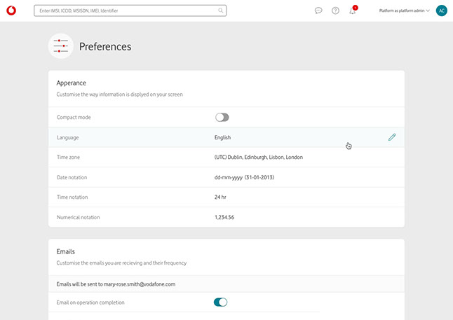
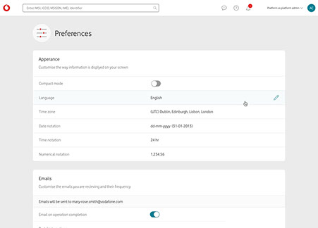
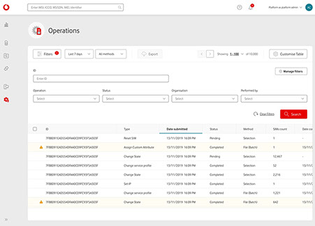
Collaborating with UX, benchmarking and analysing the popular / leading websites on data visualisation. Adopting modern browser capabilities and latest trends that can be injected to the product e.g. relaxed and compact mode, table brushing / magnification, full-screen expansion & infinite colour blind-safe palette on graphs.
06
TEAM & DELIVERABLES
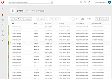
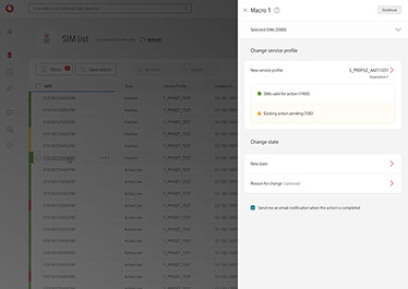
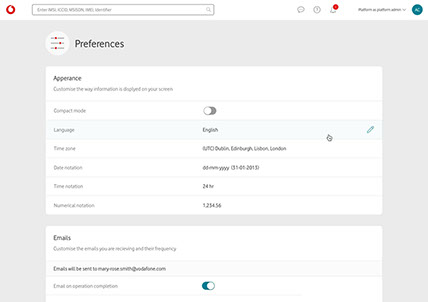
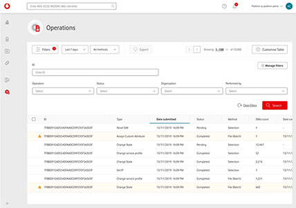
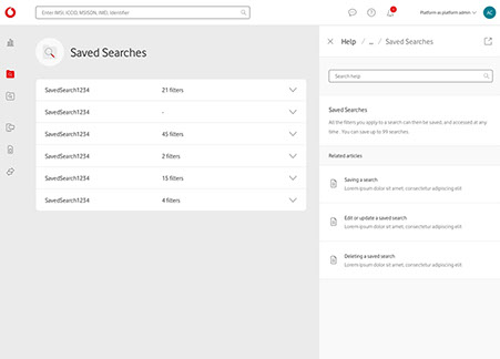
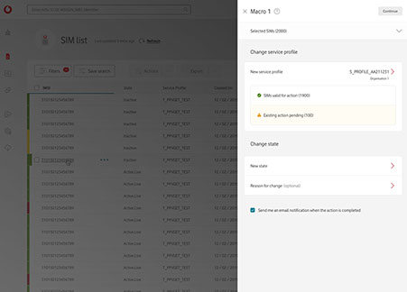
Taking wireframes set by UX and translating them into high-fidelity mock-ups. Designing screens in a rapid iterative fashion covering full interaction journeys.
The design team took part in all agile ceremonies; discovery workshops allowed the BA and UX to better understand the business requirements. Also UX / UI walkthroughs with the wider team to communicate how the UI would support the requested features, allowed other team members to ask questions or challenge design decisions.


07
TESTING
We allowed data to drive our design decisions. At most stages of the project we were measuring how well the service was working for our users. Prototype testing with current users, both expert and novice, in turn gave us valuable in-sight and feedback. These sessions helped find issues and identified potential problems, but also helped validate assumptions and support various scenarios that were raised as potential improvements.
08
FUTURE ChallengeS
Limitations arose either during the development phase or re-scoping for MVP. Features and improvements had to be descaled / removed. The challenges we faced was attempting to find short-term solution that could satisfy business and maintain an optimal user experience.
We also had to consider how this product will scale when those limitations are no longer a factor and new features can be added. The mindset was to design as if there were no limitations; designing the best experience. Keeping these patterns intact meant they could be adopted when the time was right.

Vodafone Business.
Multinational telecommunications company. Vodafone Business helps organisations succeed in the digital world.


